This is the third and last of three short articles on the thoughts that went into the process and meaning behind our new brand, from DNA to visual identity.
What is a brand? Is it the colours of a business? A logo? A particular way of behaving? The way you speak? How you treat your customers? All of them – or something completely different?
To us, our brand is our DNA. It is the way we help each other across regions. Respect for one another. Standing out as the exceptional talent we are – sharing and keeping it sharp. Our customer-obsession and longing for long-term partnerships where we can add value and again, growing businesses. It is about inspiring people, building a new norm. It is about using our strengths to change the world.
But how do you communicate as that brand, ensuring your partners connect with you and know what you stand for? With our internal house: our mission, values, and business value proposition in place, the time had come to translate our DNA into a new corporate visual identity.
The new Monstarlab visual identity consists of four key elements that each express the values of the company:
Logo incl. Quad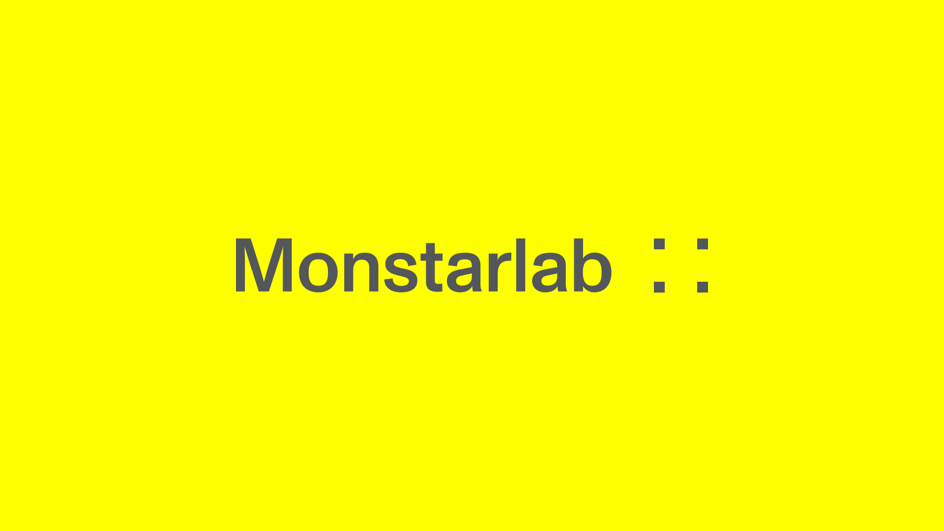
Our new logo symbolises the union of the company in the form of the Quad (the four squares). The notion of individuals — the four squares — working as “one brilliant body” is our starting point. Because when individual pieces work together as an “organism” towards one borderless collective purpose, creativity thrives. It creates sparks. And it explodes into pieces. Only to come together again from all four corners of the world to form something new and brilliant for us and for our clients alike.
The fifth element: Our Dynamic Squares

The fifth element is Monstarlab’s unique fingerprint. An element that works across our identity, as an extension of the fours squares — the “individuals” in our logo. We use data to create something creatively unique through a tool we developed for this sole purpose. Based on a grid combined with data about individuals, teams, offices, projects or Monstarlab as a whole, we will create a unique piece of creativity.
The element is an expression of our process — working together as “one brilliant body”, we bring our clients’ boutique attention to scale.
Typography
The typography chosen, Monument Grotesk by ADC Dinamo, is deeply rooted in good, classic and reliable design, but with a fresh edge. This goes well hand in hand with our aim to offer our clients a human-centered technology consultancy, challenging existing consultancies. The typography is easy to read, modern, clean, grotesque and boxy tying it together with the squares in our logo.
Colour
Our new corporate colour is yellow, highlighting the individuality across the group. We chose a bright yellow colour as our key brand colour. You could say that our visual identity consists of all the elements of the above. When combined with yellow it becomes a vibrant brand that stands out from the blue sea of consultancies, which we are differentiating ourselves from.
As a borderless technology-led digital consulting services company, Monstarlab stands out as an alternative to existing consultancies in this new era. Partnering with clients across industries and markets to grow businesses through technology, we focus on delivering quality with stunning design to our clients. With this new visual direction, we have the optimal basis for supporting this vision.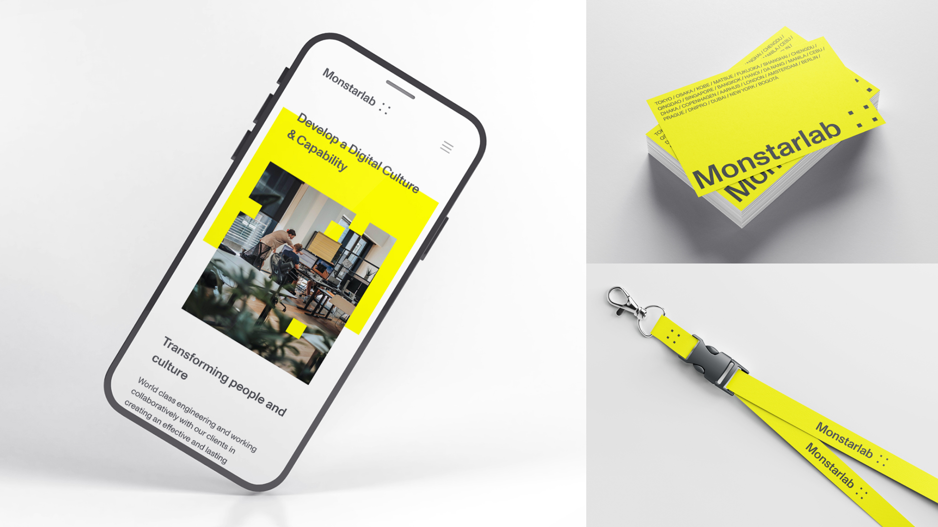
Monstarlab – From strong foundation to borderless future
This was the last in our series about our new brand, from need to challenges, process, activities, and translation into corporate visual identity.
While there is still much work to be done adjusting and implementing our new brand, we hope you have enjoyed reading about our journey, the thoughts that went into it and what it means, and will mean for our global partners.
Credits: We would like to thank our partners Uncle Grey for the direction of our visual identity and ABC Dinamo for typography support.